Top 10 Ceiling Tiles
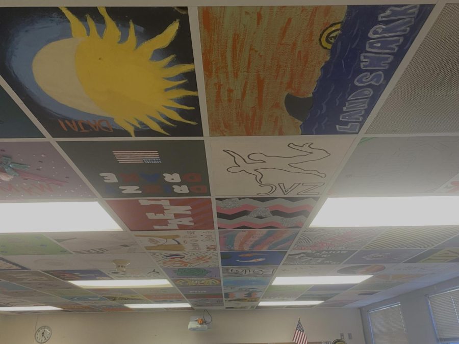
The journalism department paints their creativity using the ceiling tiles. Here are my top ten.
March 3, 2022
Rooms 408 and 410 are decorated with painted ceiling tiles. This tradition started in 2013.
The art of writing is a way to express creativity. The journalism room does not shy away from the creative flow. Decorated with beautifully painted tiles on the ceiling, each journalist has the opportunity to express their truest self. Each tile holds the ideas and personality of each individual, and these are my top ten favorites that lie within the ceiling of room 408.
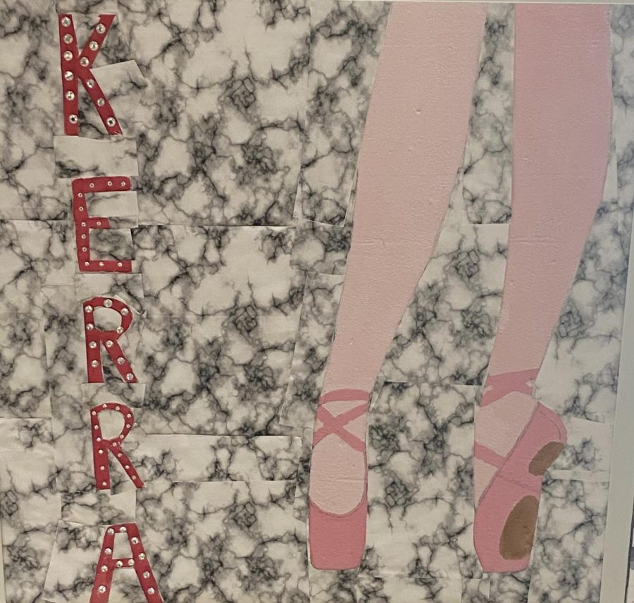
Number 10: Kerra’s Pointe Shoes
As a dancer myself, a piece relating to the sport stood out to me immediately. Although I did not know Kerra personally, her personality and love for dance stand out in this piece. The background is minimal yet still eye-catching and the pink of the shoes is beautiful. She picked the perfect shade to contrast the background of the piece. I love the addition of the rhinestones on her name, drawing your attention to the artist herself. A beautiful piece to say the least.
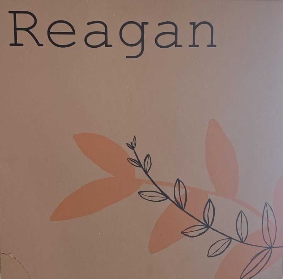
Number 9: Reagan’s Simplicity
Reagan’s piece is so simple and lovely. The font she chose to design her name in fits the style of her ceiling tile so well. I love the silhouette of the plant, the salmon color, and the linework of it mirrored in front of it. The color combination is so natural, yet they really stand out to me. When I walk into the journalism lab, the colors catch my eyes.
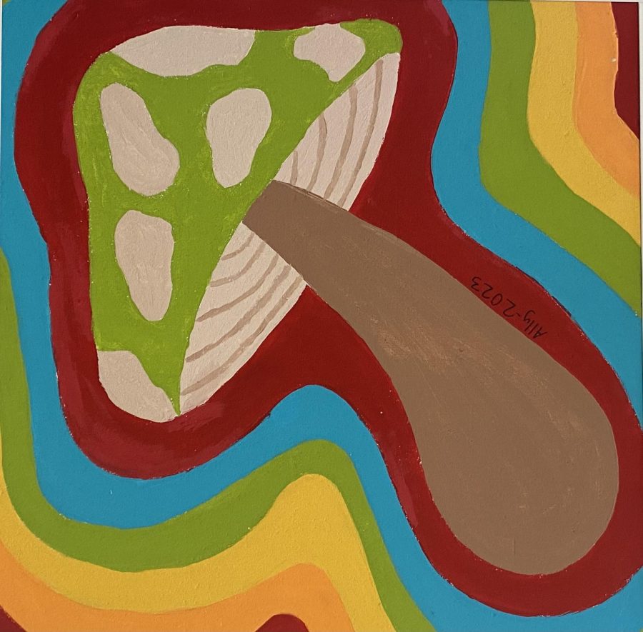
Number 8: Ally’s Mushroom Mania
The rainbow colors surrounding the large mushroom in the center automatically grab your attention when you walk into the journalism lab. The lack of a black outline really stands out in this piece. It is a subtle choice, but it changes the entire appearance of the piece. The bright colors and placement of each one really pull the painting together.
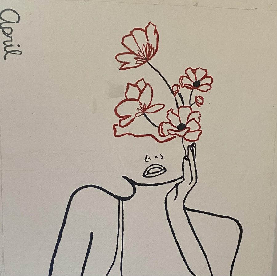
Number 7: April’s Silhouette
It is not typical that ceiling tiles are left white in the journalism department of Atlantic High School, but this choice is perfect for this piece. The piece surrounds a woman silhouette with beautiful flowers that are coming out of the top. What sticks out most about this piece is the choice of color of the flowers. The entire piece is black and white, yet the flowers are a beautiful, deep red shade. This truly grabs my attention anytime I enter room 408.
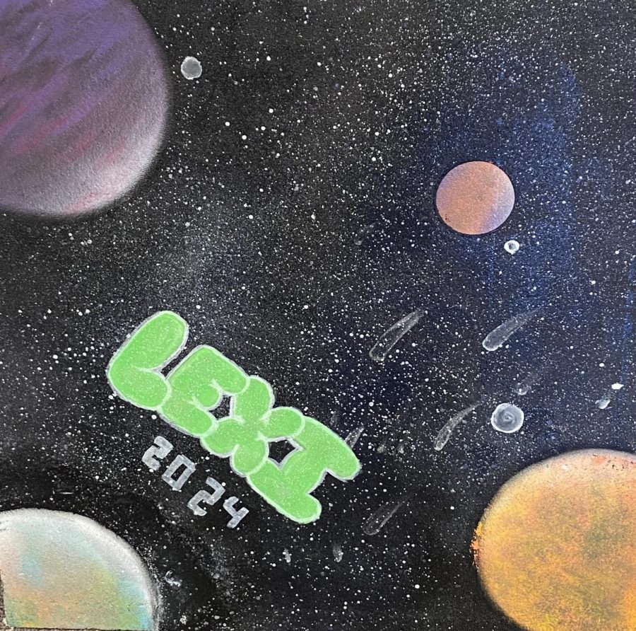
Number 6: Lunar Lexi
This tile is a new edition to the journalism room, but it truly stands out to me. This tile is out of this world. My eye gravitates towards it as soon as I enter the room. The colors of the planets go together so well. The green of their name stands out, covered in a layer of glitter. The choice of millions of stars is such a delicate detail that pulls the whole piece together.
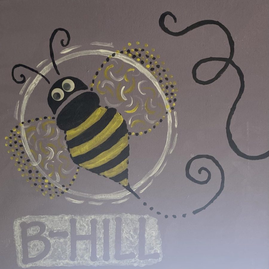
Number 5: Berryhill’s Bee
Obviously, Berryhill’s tile had to be in the top ten. Her tile fits her vibrant personality so well. The beautiful, grey purple represents calm and caring while the bee represents her bright, fun, and bubbly traits. The colors compliment each other so well and look beautiful against the black. The wings are so fun and creative. This tile is an amazing addition to the journalism lab.
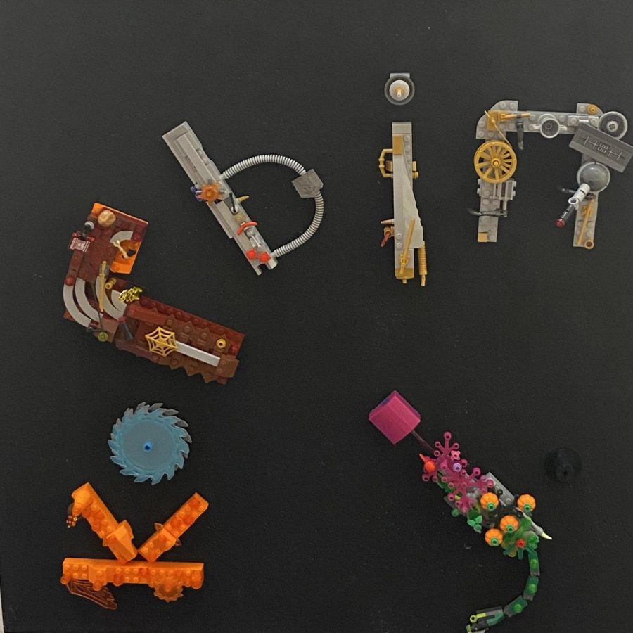
Number 4: Korbin’s Legos
Korbin’s tile is another new addition to the ceiling, but it is hands down one of the most creative pieces I have seen. His name is crafted from legos. The colors of the legos he chose perfectly go against the black background. It is such a fun tile that reminds me a lot of the child that still lives in all of us.
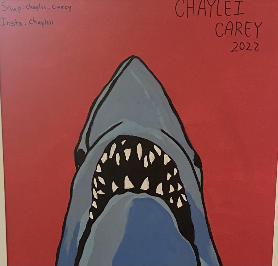
Number 3: Chaylei’s Shark
This tile stuck out to me ever since it joined the ceiling. It is one of the only tiles with a bright red background so your eyes naturally gravitate towards it. The shark is such a fun addition to it as well. The colors contrast against each other, making each part stand out. The shading within the shark gives it a comic-like feel, yet it somehow still looks so realistic. The addition of her Snapchat and Instagram also makes me giggle a little.
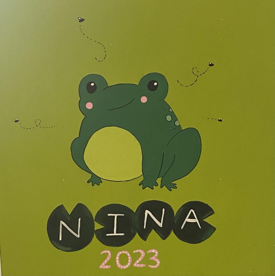
Number 2: Nina’s Little Friend
I love Nina’s tile! The shades of green grasped my attention as soon as I noticed it. The little frog in the center is absolutely adorable. The simple face with the cute lime green accents perfectly represents Nina. Then, her name in the lily pads just makes it so much cuter. It really pulls the entire piece together. The little bugs flying around is another cute touch that really makes this piece whole.
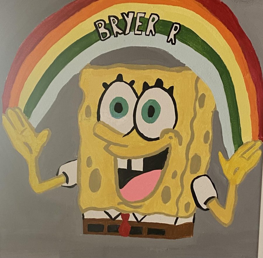
Number 1: Bryer’s Imagination
Bryer’s tile is hands down a favorite by many in the journalism room. It is such a beautifully painted piece. The scene from Spongebob is him explaining his “Imagination” and I think that fits wonderfully in the journalism room. Looking at the tile reminds us all that having an imagination makes us all human. The colors work so well together. Spongebob looks absolutely perfect, and her name is placed in such a great spot. This definitely deserves the title of number one in my eyes.
